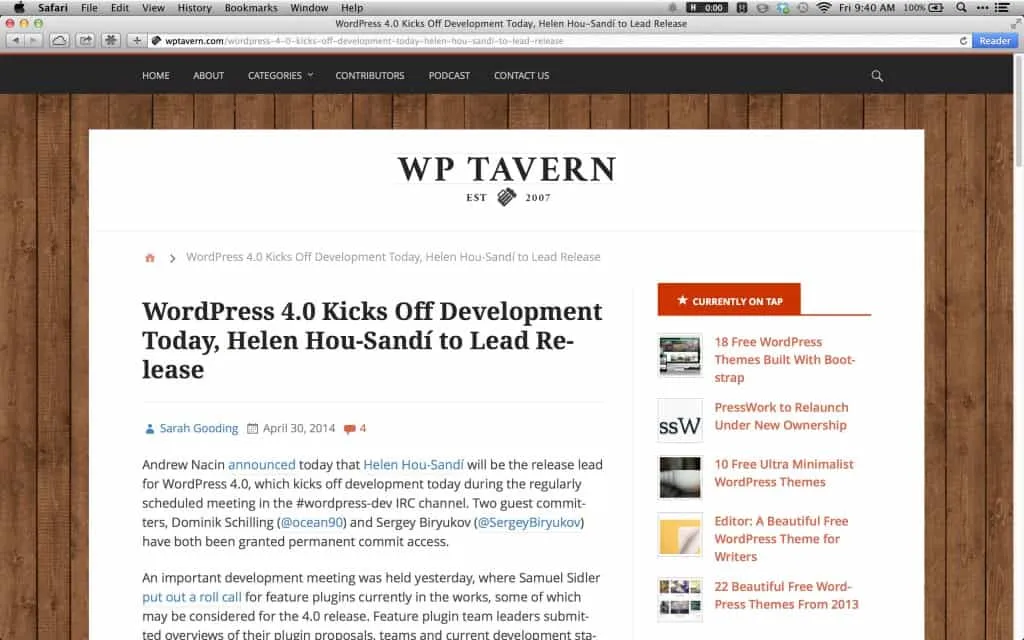
Box your website, or let it breath?
Published on
When you set out to design a new website, especially a writing centric website, how you present the primary content is often a major concern. Boxing your website is a technique that was mostly used a lot during the previous decade, but is starting to fade.
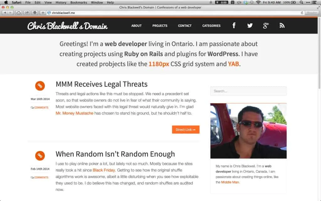
Here is a screenshot of the previous version of this site. See how my content doesn’t have any fixed restriction on it. Even though the boundaries of 1180 pixels exists around the content and sidebar, I don’t put a visual box to show this bounds.
Which style do you prefer? Do you see a trend in one direction or the other?